April 7, 2015
Weekly Update
This week, I have decided to write a little meta-post about my final project (which can be found here) to discuss some of my motivations, challenges and successes around the project.
I decided to do this project because my life as of late has been very salmon-centred. From April - November 2014, I worked for the City of Surrey's Salmon Habitat Restoration Program (SHaRP), where I led high school students in conducting salmon habitat enhancement works and educating the public on salmon stewardship. Currently, and somewhat ironically, I am working at a sustainable seafood store where the majority of sales are salmon or salmon derived products. Seeing as I was already a bit of an expert in all things salmon, and concerned for the future of the species, I decided to apply my GIS skills to understanding some of the threats to salmon.
My main challenge in this project was figuring out how to get the statistics I needed out of a huge amount of data. I first thought I would do this by using R statistical software, but after learning a bit of Visual Basic to clean my Excel data, I realized it would probably be easier to continue using Excel for my analysis rather than trying to get my analysis to work in R. Using internet resources, I slowly learned how to use VBA to interate through all my different workbooks and perform identical analyses on each. The biggest breakthrough in this processes was definitely discovering the power of pivot tables, and using automating them using macros.
The biggest obstacle was creating a moving window for inter-annual variability, but I eventually figured out how to do it using the splicing tool and the loop function. All my VBA codes I put up for download so other researchers can take advantage of them if they wish.
Overall, I think my project successfully displayed the extent of my GIS capabilities and growth of my GIS skills over the term. Though the project was somewhat limited in its scientific validity (see Discussion page of final report), I am proud of what I did manage to show in through my analysis, and I think further study of the topic is needed.
March 31, 2015
Weekly Update
This week we did our final paper reviews and presentations, this time on the topic of crime, geography and spatial analysis. For my presentation, I read a paper about mapping the social networks of crime in Los Angeles. Though I found the paper a little hard to understand at my skill level, I still enjoyed reading it. You can find a more in-depth discussion here.
March 24, 2015
Weekly Update
This week we started to work on our projects. For me, that meant gathering data on salmon species, hydrological run-off, and the watersheds of Vancouver Island since my project will be examining hydrological run-off regimes and their trends. Right now, I don't have much to report but will write an in-depth discussion of my process in the weeks to come.
March 17, 2015
Weekly Update
This week we learned about the applications of GIS and spatial analysis to crime. As crime is caused by humans and takes place in some spatial context, patterns of crime are non-random and a prime area for GIS research. As we learned in lecture, there are three broad theories of crime as related to geography:
- Routine Activity Theory: the theory that criminal choose to commit crimes at opportunistic times and locations throughout the cycles of a day, and those opportunities are the chief determinant of crime occurrences.
- Rational Choice Theory: this theory considers the decision process of criminals at individual instances. It is geographical in nature because it theorizes where criminals will find the best opportunities for crimes.
- Criminal Pattern Theory: This theory places seeks to explain the likelihood of crimes occurring with the patterns of the offenders in their everyday lives. Potential offenders have patterns that they use when looking for crimes of opportunity.
These theories have been applied to GIS to perform tactical and strategic crime analysis. One of the earliest examples of tactical crime analysis was in the case of the South African Wemmerpan serial killer case [pdf], where GIS was used to illustrate the suspects movements in a "much more flexible, versatile and easier" way than paper maps to the detectives and eventually the jury (though it is worth noting that in this case GIS was used primarily for display purposes, not spatial analysis). The paper I read for this unit, read Spatializing the Social Networks of Gangs to Explore Patterns of Violence, was an excellent example of a strategic geographical crime analysis as it considered underlying factors (in this case, social networks) when analyzing crime.
While GIS has proven to be a powerful tool in understanding crime, it has not been without its shortcomings. One recent attack on GIS in crime analysis has criticized practices as being inconsistently applied with little understanding or testing of their overall effectiveness [link]. As GIS is still a relatively young technology, and crime is a massively complex social phenomena, it makes sense we may be in the metaphorical stone age when it comes to geographical crime analysis, which makes for a very exciting future indeed.
Lab 4: Introduction to CrimeStat
In this week's lab, we used a program called CrimeStat, a powerful add-on to ArcGIS, to understand patterns of crime in the Ottawa area. Using data on a variety of crimes (breaking and entering commercial, breaking and entering residential, and stolen vehicles), we performed a number of analyses to understand the spatial patterns of crime. This was a good example of a tactical analysis of crime, as we were seeking to understand where crime was occurring, not why it was occurring there. Among the analyses we performed were nearest-neighbour, fuzzy mode, Absolute Nearest Neighbor Hierarchical Spatial Clustering, Knox Analysis, and Kernel Density. For this blog post, I will focus on discussing the method and results of the kernel density analysis.
Kernel density analysis is an alternative to a histogram that is particularly useful in spatial models. How it works is that it lays a smooth surface over a map, then the value of each raster cell is calculated based on the number of points that lie around it. The method of determining those points varies, which will be discussed in the next paragraph. The result of the analysis is a surface that shows the density of underlying points. This is quite useful for crime analysis because as we demonstrated in the lab, it can create a map of risk in any given area. The map from the lab below shows the risk for residential breaking and entering crimes (B&Es) in Ottawa created using a kernel density analysis.

In the map above, a triangular method of interpolation was used. This means that for each cell the value was calculated by taking the cells within the determined radius and weighing them linearly with distance. This varies from quartic and negative exponential interpolation techniques, where weights are assigned according to a exponential function, and also the uniform interpolation technique, where every cell within the radius is given the same weight.
While the map above can give us a good idea of the risks of residential B&Es in Ottawa, it has a fairly fundamental flaw in its cartographic communication: it does not consider population, only the quantity of crimes. Solving this problem and creating a relative map of risk in the area is where dual-surface kernel density analysis comes into use. This is done by taking one layer and modifying it by another. There are number of calculations that can be performed, but for our analysis we used the ratio of densities method, which divided the crime points by another file showing population. The map below shows the results of that analysis:

As you can see, the dual kernel density map is much less alarming and generally gives a better idea of the spatial distribution of crimes. This is perhaps best represented by the downtown core, which in the single layer looked much more risky than in the dual layer analysis, where the risk has been adjusted for the large population. There are a lot more complexities in this type of analysis than I will go into in this post, but it was very interesting to explore the possibilities of this analysis in a practical setting.
March 10, 2015
Weekly Update
This week in lecture we presented our second round of paper reviews. I presented on a paper that argued for alternative mapping methods for late-testers for HIV in Texas. You can read about it here.
We also worked on our CrimeStats lab.
March 3, 2015
Weekly Update
This week we discussed the applications of GIS to health (or medical) geographies. Several topics were discussed, including spatial epidemiology, environmental hazards, modeling health services, and identifying health inequalities. For this blog entry, I am going to focus on mapping environmental hazards.
Environmental hazards differ across the landscape. Certain areas are more prone to pollutants and other detrimental factors than others, and GIS can help to analyze and visualize these areas as to better understand them. Generally, environmental hazards can be understood in three dimensions:
- Hazard surveillance: this involves the mapping of the hazards themselves. This might include mapping polluting factories, toxic dumpsites, nuclear reactors, or former facilities that are still causing pollution.
- Exposure surveillance: this involves mapping the exposure to detrimental pollution caused by the hazards.
- Outcome surveillance: this is more closely aligned with other aspects of medical geography and involves the mapping of health outcomes produced by exposure to the hazard.
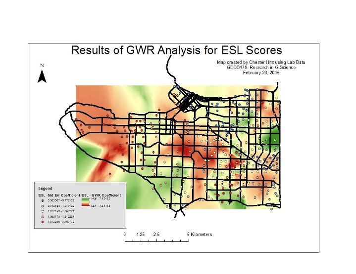
Often, these dimensions work in interaction with one and other when attempting to understand environmental hazards. For example, overlaying a map of hazards on a map of health outcomes caused by those hazards and then analyzing them (using geographically weighted regression, Morans I, etc) could produce powerful insight into the hazards and their subsequent effects.
GIS has been used prolifically to map health hazards since it has come into maturity. Examples include mapping asthma as a result of air pollution in the Bronx (NYC), mapping air toxins from a yeast factory in Oakland, or mapping the Bhopal disaster in India. However, I can't help thinking of how useful GIS would have been in several famous historical instances of environmental pollution that had human health impacts.
One such case is Love Canal, an ironically named neighborhood in Niagara Falls that was built on top of a terrible toxic waste dump. It was an interesting case because rather than a case where toxic waste entered an inhabited area, the Love Canal case was described as a case where residences "overflowed into the wastes instead of the other way around." To summarize the rather unbelievable story, a school district bought and then developed two elementary schools on an abandoned toxic dump despite warnings from the chemical company and many scientists. Several homes were constructed near the site as well. It did not take long for terrible health effects to emerge and soon Love Canal became a national scandal and well-known planning disaster.
.jpeg?timestamp=1426463373277)
A scene at Love Canal.
It certainly would have been interesting to see how the Love Canal scandal would have changed had GIS technology been around at the time. Though negligence, not lack of data, seems to be the chief culprit in the Love Canal disaster, it is an interesting thought experiment to wonder how GIS might have mitigated the issues at Love Canal, or at least have brought further justice for the victims. By mapping the toxic dump site and the health cases around it, perhaps a more solid case could have been built for the victims or something could be learned about the spread of toxins through groundwater. Nonetheless, the emergence of GIS has been a great benefit for understanding environmental hazards.
February 24, 2015
Weekly Update
Housekeeping note: the past two weeks there has been no lecture in class (due to Family Day and Reading Break) and generally Lab 3 took up the majority of my time.
This week we dove into a new topic: Health Geography, or "Medical Geography". Health and geography have long-been interconnected, with one of the most prominent historical problem-solving via spatial-thinking examples being related to the placement of water pumps to prevent the spread of cholera. Since then, geography has become integral to understanding health in three dimensions - disease ecology, health care delivery, and environment and health. If you think about it, geography is such an important part of things like disease ecology that we expect to see maps when an infectious disease is spreading (as with the Ebola epidemic in 2014).
Like other sub-disciplines of geography, health geography has grown through the years without controversy. Researchers and thinkers launched broadside attacks on "medical" geography from the 1990s to the present day, accusing it of being too hierarchical and ignorant of the power relations in society that shape the geography of health. This is also why 'health' geography is used in place of 'medical' geography today, as the former is seen as less limiting than the latter. This has led to a perceived split between "medical geographers" (quantitative, analytical, non-political) and "health geographers" (qualitative, political, rooted in social theory).
Despite of, and in many way because of these changes, health geography continues to be relevant today in many forms. Trevor J. B. Dummer lists some of the modern applications of health geography in his commentary to the Canadian Medical Association Journal, which can be found here:
- Geographic accessibility of healthy foods
- Land-use planning and influences on socio-demographic variation in physical activity
- Disease surveillance, modelling and mapping
- Infectious disease control, including mapping malaria outbreaks, leprosy elimination and Lyme disease surveillance
- Analysis of geographic clusters of deaths due to breast cancer
- Geographic variation in inflammatory bowel disease and the identification of potential environmental risk factors
- Local and modifiable influences on diet, physical activity and obesity
- Adverse pregnancy outcomes among women living close to incinerators and sources of environmental pollution
- Access to hospitals and family physicians, and the use of hospital inpatient services
- Regional reorganization of cardiovascular surgery provision
- Rural–urban and intrarural variations in health in Quebec
- Social and spatial polarization in health outcomes across the life course
- Influence of woodland and green space on adolescent mental health
- The role of city image, risk perception, environmental stigma and neighbourhood inequality in characterizing healthy and unhealthy places
As Dummer notes, there are some inherent risks to using geography in shaping medical practice and policy. Mainly, the risk is from the ecological fallacy that arises when using aggregate data. The ecological fallacy occurs when assumptions are made about an individual based on the area they live in. For example, assuming an individual from Mississippi is obese because the state has an above average rate of obesity would be an example of an ecological fallacy.
Next week we will move onto direct applications of GIS to health geography and we will approach these issues once again.
Lab 3: Geographically Weighted Regression
In this week's lab we explored geographically weighted regression and other advanced spatial analysis techniques. Regression is an analysis technique that is prevalent throughout the social sciences and many other disciplines as well. In its simplest form, regression measures the effect of a single dependent variable against one or more independent variables. While a simple regression analysis has valuable uses when looking at some statistics, it has some notable weaknesses when it is applied to spatial analysis. This is because it is a global regression analysis and therefore assumes stationarity in the data, or a fixedness in a process over the landscape. However, as geographers and spatial analysts intimately know, processes almost always vary over space, or are non-stationary.
Geographically Weighted Regression (GWR) is an analytical technique designed to take the inherent strength and clarity of the simple regression model and apply it to spatially varied contexts. Rather than relying on global data, GWR is highly localized and calculates different coefficients and intercepts for each and every areal unit. This calculation is not based on global data, but rather the values of cells adjacent to the cell for which coefficients are being calculated.
In this week's lab, we used spatial analysis try to understand the interaction between social and language test scores (dependent variables) against a host of independent variables. Using GWR, OLS, and grouping analysis, we used Vancouver as our study area. As a result of the lab, it was determined that the processes governing test scores and socio-economic factors are not stationary across Vancouver, as can be seen in the map of GWR results:

In this map, the underlying raster is showing the coefficients, or the degree to which underlying social values predict test scores. The results of higher raster values on the map (red value) show area where the ESL scores have more of an effect (correlation) than the blue areas. There is no dominating pattern to the coefficient results, but there does seem to be stronger correlation in East Vancouver.
February 2, 2015
Weekly Update
Much of classtime this week was just spent doing paper review presentations, which you can read about here (Paper Review 1: Spatial Ecology).
Next week I will write about the third lab and health geography.
January 23, 2015
Weekly Update
This week, we continued to dig into spatial issues while working on our labs in Fragstats, which I will write about later in this entry. In lecture, we have been examining topics like stationarity, spatial autocorrelation, and different sorts of processes that occur across a spatial landscape. To deepen my own understanding, I will be examining the concept of stationarity for this blog post, as well as writing about the lab.
Stationarity can be a difficult concept to grasp and I had to look up several definitions to understand it. The clearest definition I was able to find came from ESRI`s ARCGis Resource page which did a good job of defining it and laying out the assumptions upon which the definition was built. Basically stationarity comes into play when you are trying to extrapolate values based on known values (for example, when kriging). Since geostatistics assumes that values are random but not independent of each other, stationarity is used to distinguish the type of randomness when extrapolating values. When an area possesses stationarity, it means that the process affecting that area under study remains constant.
The best example of stationary versus non-stationary I can think of would be the vegetation in a flat desert landscape vs. vegetation in an alpine landscape. In the desert, the spatial distribution of vegetation does not vary much from one square meter patch versus another because the process affecting the distribution of vegetation remains constant due to the flatness of the terrain. Compare this to vegetation in an alpine landscape, where certain species have adapted to live in crevasses, under rocks, etc. and the processes determining placement varies considerably because of the natural processes of the landscape.
While the above is far from a perfect example, it helps me understand the difference. However, stationarity vs. non-stationarity should not be misunderstood to be as simple as homogenous vs. heterogenous. Rather it is the process itself that varies, not the landscape. One patch of desert landscape is heterogenous to another, but they both possess similar means of species counts because they are subject to a similar process. An alpine landscape would not possess similar counts as the process of placing vegetation varies spatially.
There are two types of stationarity. The example above largely refers to first order or intrinsic stationarity. As defined in lecture:
A process can be first-order stationary if there is no variation in the intensity over space (that is, the mean (x̅) for any arbitrary region is the same).
Applying this to our example, a patch of desert possessing stationarity will have the same mean density for cacti species in it no matter what scale it is measured at. This is first order stationarity.
Second order stationarity is even more confusing than first order stationarity. As defined in lecture:
A process can be second-order stationary if there is no interaction between objects / events (that is, the autocorrelation function depends solely on the degree of separation of the observations in time or space, not on where those objects occur).
In layman`s terms: when a landscape possesses second-order stationarity, you can select any two sets of any two points that are the same distance apart and they should have the same amount of difference. The only thing that might create a change in the difference between the two sets is if one set is further or closer than the other set - that is the the only determiner.Overall, stationarity is both a tricky and simple concept. I am still trying to fully wrap my head around it, and hopefully will come to a bit deeper of an understanding as I go through the semester.
Lab 2: Exploring Fragstats
The first lab we turned in, Lab 2, explored using Fragstats software to analyse land use changes. We used data from the Canadian Land Use Monitoring Program (CLUMP), specifically data from around Edmonton in 1966 and 1976. We used to ArcMap to first break down the data and visually compare the differences in land use between the two years, as seen below:

After we had done that comparison with the vector data, we converted it to raster data at two different resolutions. This was done to examine the differences in metrics between the two different resolutions (100 meter vs 250 meter cell size) later on in Fragstats. However, before we did that, we visually compared the differences between the two cell resolutions.

Once we had done all the preliminary work in ArcMap, we got down to brass tacks with the Fragstats software. On the Fragstats website, the software is described as such:
FRAGSTATS is a computer software program designed to compute a wide variety of landscape metrics for categorical map patterns.
Put differently, Fragstats offers a wide range of analytical tools to slice, dice and examine raster maps with distinct categories, producing valuable analytic metrics for use in research and consulting. We used these metrics in our final report which was formatted like a consulting company's report to the City of Edmonton regarding land uses. While we examined a lot of metrics, I will just examine one, in depth, for the blog.
Shannon's Diversity Index (SHDI) is one key metric we examined. The metric is an index of diversity in the landscape that is the proportional abundances (aka 70% cropland) times the natural log of those abundances of all the class types, summed into a single statistic. It ranges from zero to infinity, with higher values indicating higher diversity,
Image from Fragsts Help File
The only statistic SHDI takes into account is the proportion each land use take sout of the total (for example, cropland as 70% of the land use). If infinite uses took up equal parts of the map, you would get infinity as the diversity index. If one use dominated completely, you would get a very low SHDI index.
I found that in the case of Edmonton from 1966 to 1976, the diversity metric increased, due to the decline of cropland and increasing amount of other land uses, which leads to a more diverse landscape overall, as can be inferred from full page maps.
January 14, 2015
Weekly Update
Hello and welcome to my first blog entry for GEOB479: Research in GIScience. I am using the web-builder Yola for this blog as I wanted to practice some of my newly acquired HTML/CSS skills rather than be confined to UBC Blogs platform.
This week we have been talking about some basic spatial problems as we explore landscape ecology and GIS. A lot of this is review for me, but still very useful as I have not taken a GIS class in a few years. I've had to think hard and look at some old notes at times, but overall I am feeling pretty good about the material we have been studying.
The issues we are looking at are some of the most well-known in GIScience and include: the modifiable areal unit problem (MAUP for short), ecological and individualistic fallacies, Simpson's Paradox, and more. To increase my own understanding, I'll be looking at the MAUP for this blog.
The Modifiable Areal Unit Problem is a problem that has plagued spatial analysis for almost a century. In short, it refers to the problem wherein results of an analysis are more of a result of the type of areal unit used in analysis rather than in any real world phenomenon "on the ground". More succinctly and clearly, the MAUP can be described as:
“a problem arising from the imposition of artificial units of spatial reporting on continuous geographical phenomena resulting in the generation of artificial spatial patterns”
(Heywood, 1988).
Breaking this down, the "imposition of artificial units of spatial reporting" refers to the scale at which an analyst would chose to examine a particular phenomenon, for example conducting a census at the block or neighbourhood level. This "imposition" results in the "generation of artificial spatial patterns" which are more the effect of those artificial units than the phenomenon on the ground.
For example, consider the distribution of the invasive and highly dangerous species Heracleum mantegazzianum, or Giant Hogweed, which is found in B.C. and often comes in clusters. Looking at the distribution of the plant on the basis of regional districts might lead you to conclude that Vancouver (just the city) is overrun with these plants because the unit of regional district for Vancouver, Greater Vancouver, includes areas like Surrey and Coquitlam where the plant is more prevalent. A few clusters in those cities result in the whole Greater Vancouver area becoming part of that particular phenomenon, not because it actually is, but because of the spatial unit used. This is an example of an ecological fallacy. Using city boundaries would result in a more clear and accurate visualization of the spread of Giant Hogweed in Greater Vancouver.
While this may seem like an obvious and unavoidable problem, it is very important to GIScience and spatial research. It shows that whenever one is conducting analysis, it is best to be mindful of the areal unit used in that analysis to ensure maximum accuracy.
This is my blog for GEOB479: GIScience in Research class, taught by Brian Klinkenberg in the Spring of 2015. Created by Chester Hitz.